Facilitating internal communications
Team: 2 Developers, 1 Business Analyst, 1 UI/UX Designer, 1 Product Owner.
My Role: Lead Designer(User research, Wireframing, Interaction + UI Design, User Testing)

Note: Due to this being an ongoing internal project, I am limited in the amount of information I can show. Please email me for more info :)
Problem
The existing application was created as an extension of commonly used software. It was put together quite a few years ago and the users consistently encountered errors and relied on the SME to put out fires. The organization of the application was confusing and caused timely mistakes.
Solution
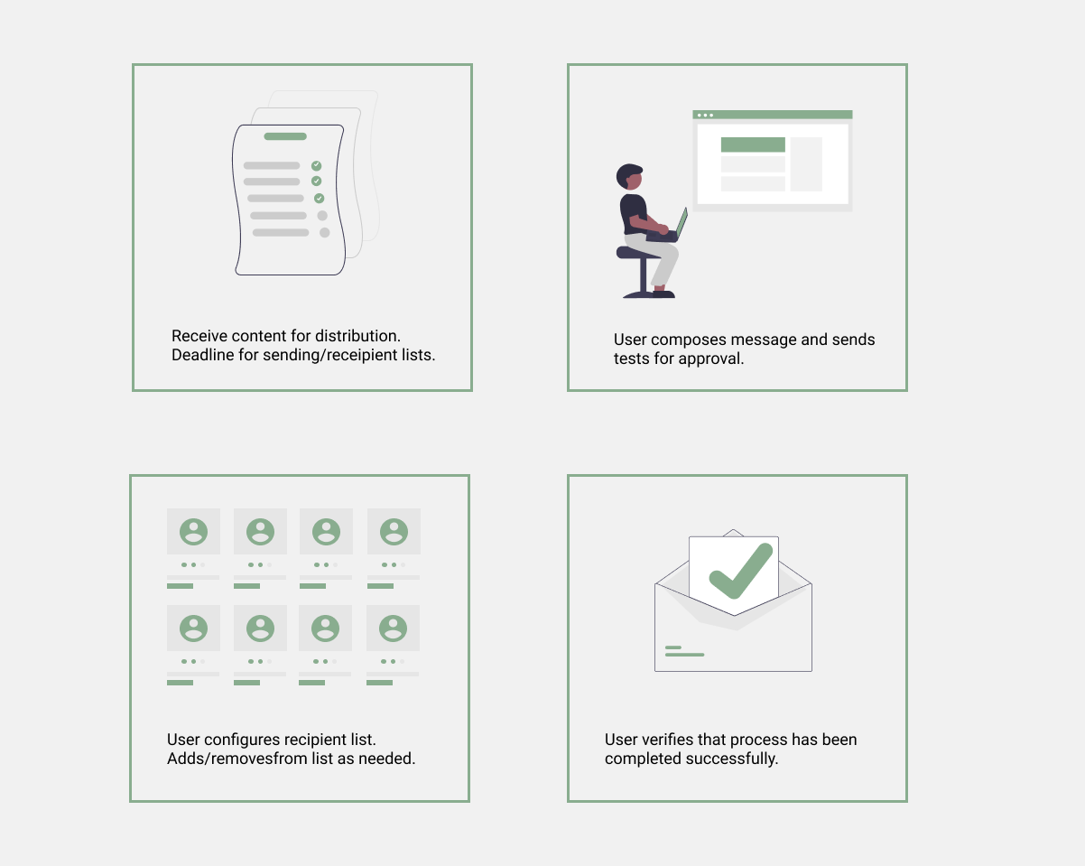
After careful analysis, observations, and organization, a new web application was designed that guided the user through the process of sending messages. Many of the unused and outdated features were removed to avoid clutter. New features were introduced that optimized the process and improved the experience.
Design - Research
Initial Analysis
When beginning this project, I looked over the existing application as it was being used. I utilized my notes from kick-off meetings to attempt the most common tasks as described by the super users. Using Nielsen Norman's 10 usability heuristics as a guide, I noted some of the UX issues I encountered. Some of these included:
- Proximity of buttons created confusion - Destructive actions were too close to main actions.
- Information Architecture - Some of the steps required moving around to different parts of the application and then back.
- Copy was confusing and inconsistent to verbiage normally used in applications.
User Research
Ethnographic Research
With limited access to users, I communicated with the main super users for feedback. Super users make up about 85% of the total usage. I carefully observed the main user go through the entire process of sending a message from start to finish while he talke through all the steps. Throughout this exercise, I noted down pain points, likes/dislikes, and wishlists. I found that numerous sections of the application didn't appear to be used at all. These observations were further clarified by follow up interviews.
Competitive Analysis
I also reviewed how other applications were laying out their message building process. Some applications I reviewed:
- MailChimp
- Sendinblue
- Constant Contact
Design - User Flow and Wireframing
User flows
After I gained more insight on how the application was used and where improvements were needed, I sketched out a user flow based on the super user's process. Using this flow, I was able to narrow down the steps and write down possible issues to present to the product owner. This part was crucial to clarifying and finalizing what features and enhancements were possible with the available resources, time and the platform where it would be developed.
Information Architecture & Wireframes
Using the information gathered through the flows, I re-organized the content to follow a clear direction based on the steps taken to complete the main action. In the previous version, step 1 and 2 were found on two completely different tabs and the application was not intuititve.
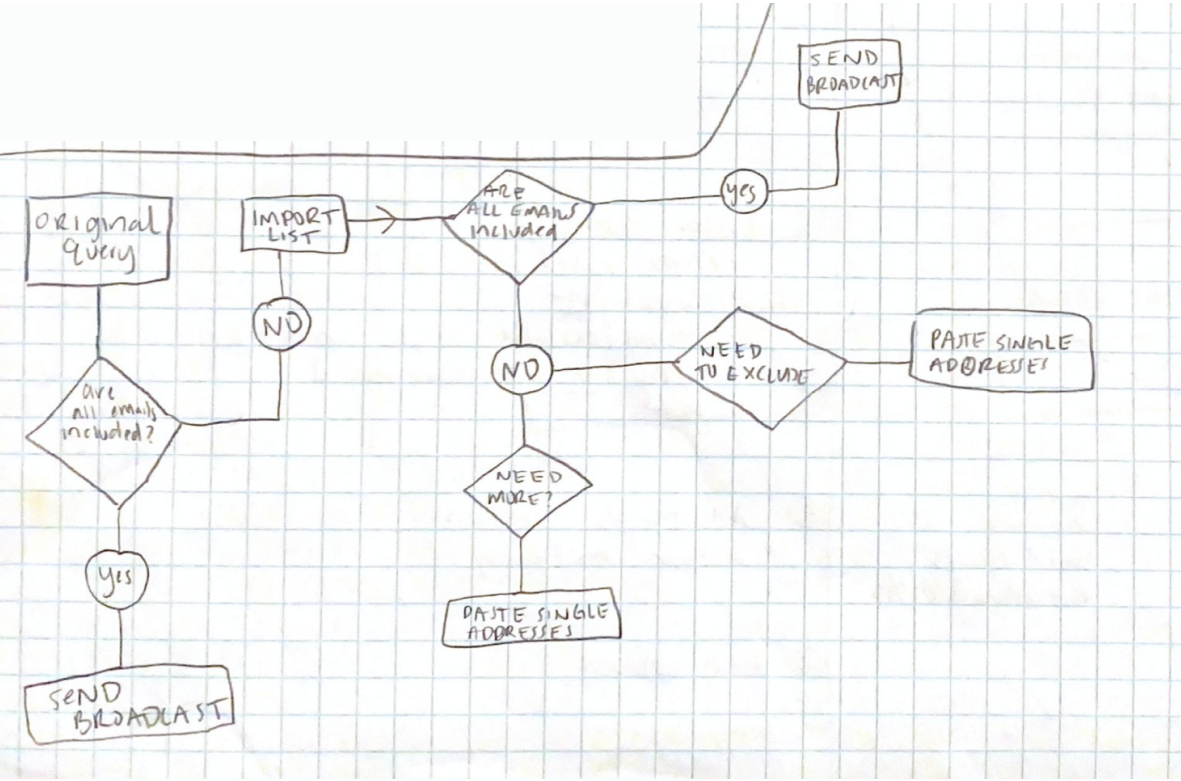
Many features of this project required multiple iterations, the main focus being the query: Selecting and modifying the recipients. The team often needed a very specific recipient list and it was important to be able to include/exclude and/or paste an existing list.
In my initial wireframes, I laid out the content in collapsible sections that were marked with step names. I also grouped features based on where they were needed. For an example, the "test send" button was hidden in another section and the user would navigate over every time they wanted to preview the message. This would consistently create problems with sending accidentally, which was very embarassing as many people would receive it.
Design - Prototype, Testing and Iterations
Using AdobeXD, I created an interactive prototype using my low-fidelity wireframes. Since access to users was limited, I preformed guerilla user testing and presented the prototype to 5 different colleagues including the SME of the original application. I gave each user a list of tasks and watched as they completed it. From my observations and feedback, I iterated on my design.
After the prototype was finalized, I began on the visual design. Using our brand style guide, I transformed the wireframes into high-fidelity final versions. These were also presented and tested the same way in order to locate any typography, hierarchy and color decisions that could possibly confuse the users
For final developer handoff, I built the pages needed using HTML, CSS and JavaScript as needed for interactions.
What I learned
Note: This project is still in development.
I learned a lot from this process including how crucial it is to have as much requirement clarification as possible, especially when complete a "re-design". I also learned to be familiar with the platform it will be built on to minimize the amount of design changes. What I designed to be a simple input was eventually turned into 3 inputs since the platform couldnt accomodate the functionality I intended with my design. This also drove home the idea that communication early and often is extremely important!