Summary
Builder Portal was used by construction companies in Houston to request gas service lines and meters, but the customer experience had not meaningfully evolved in over a decade. Registration was manual, statuses were hard to interpret, and request forms created repeat errors.
For phase one, we refreshed the UI, improved a few high-friction workflows, and gave users more control over registration, company switching, request organization, and form completion.
Impact
The Problem
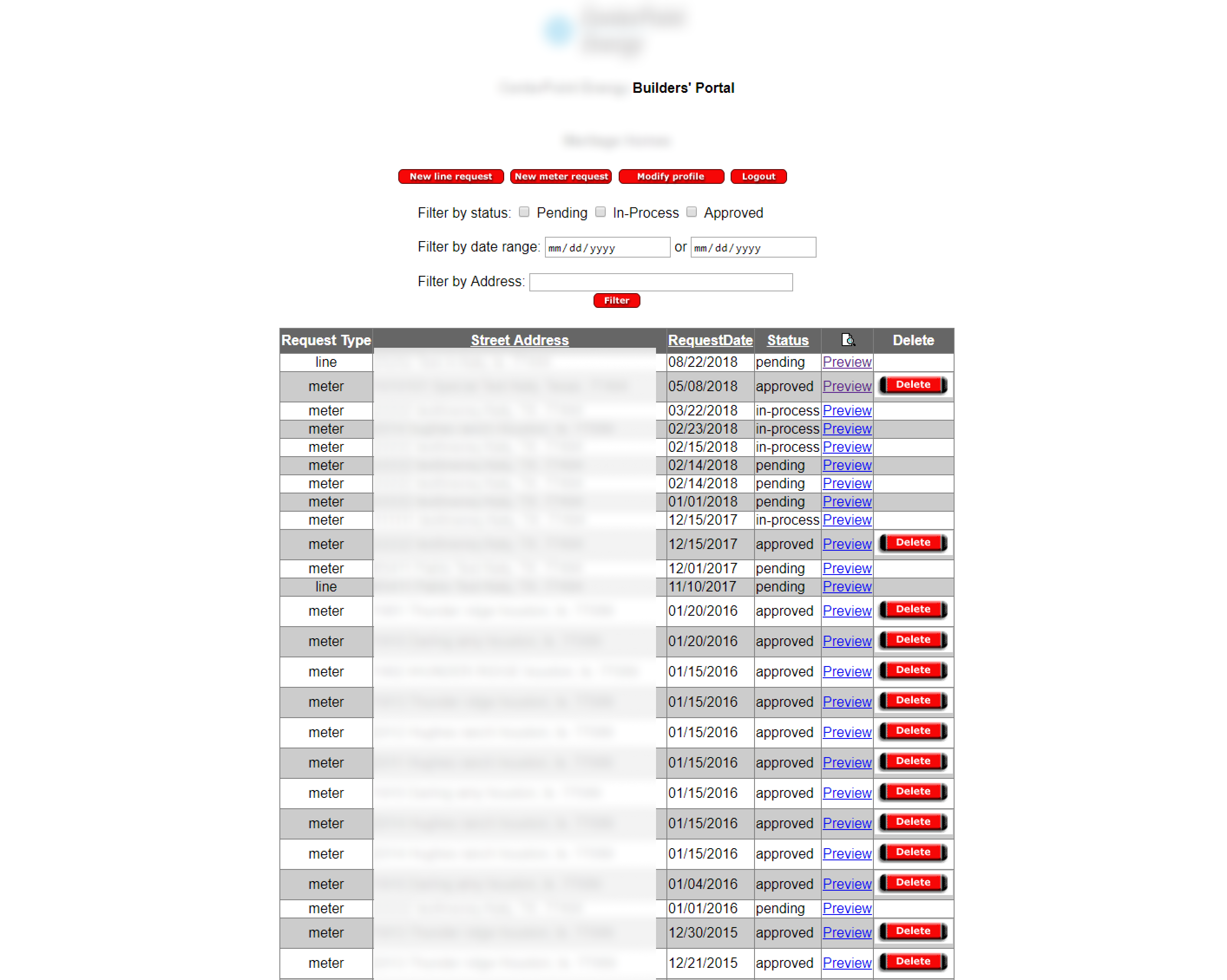
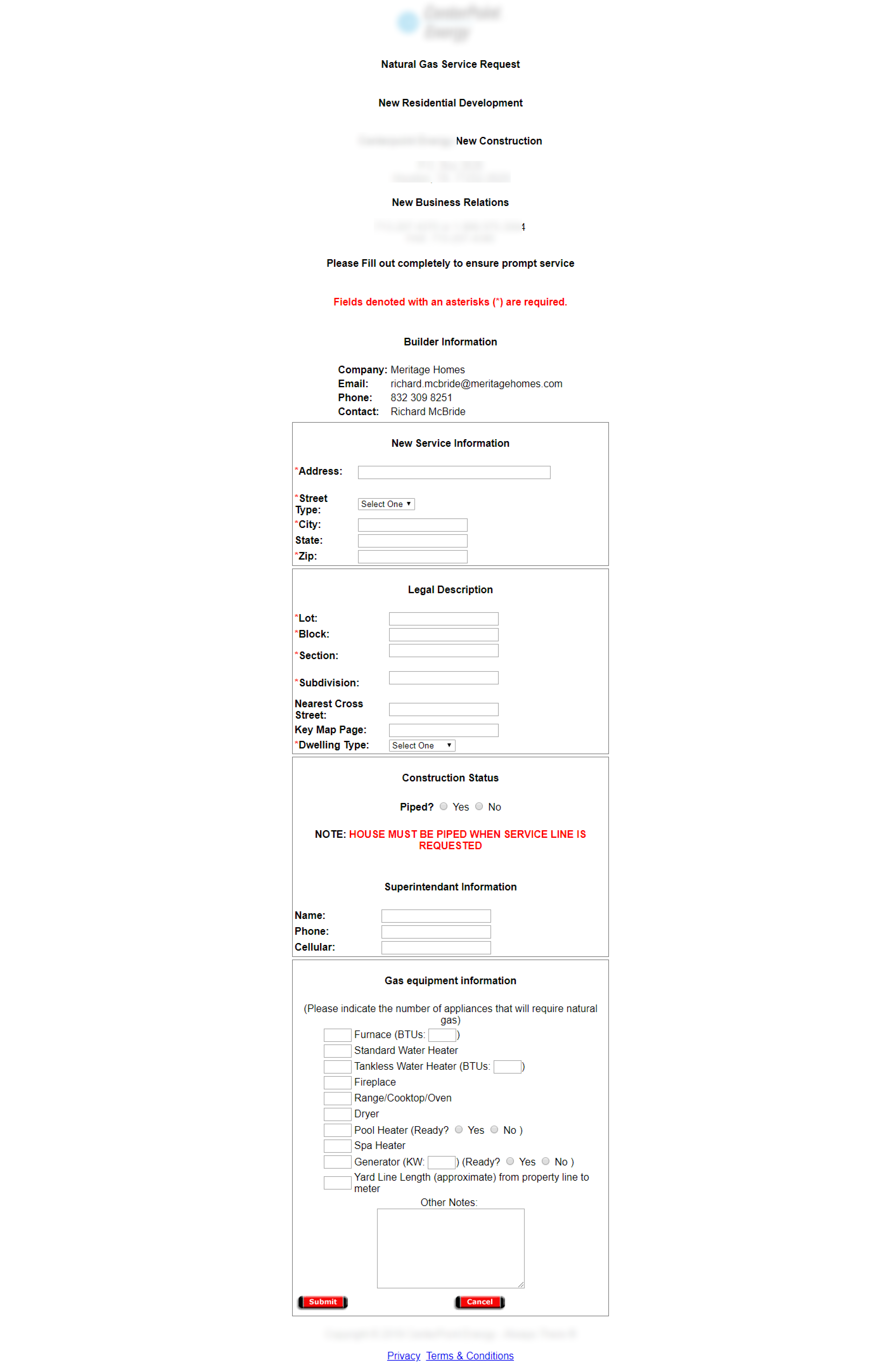
The portal did not give customers enough information about request status, and the forms regularly caused errors or duplicate submissions. Users also needed separate usernames for different companies, while registration depended on customer service and could delay active projects.
Customer pain points
- Status updates were misleading or too vague.
- Registration required customer service involvement.
- Rejected forms often meant re-entering the same information.
- The experience was difficult to use on a phone.
Business pain points
- Support teams fielded repeated questions about status and access.
- Legacy UI made the product harder to trust and maintain.
- We needed to improve the experience while staying within phase-one constraints.
Research
The project started with stakeholder and customer-service conversations to understand the full request lifecycle, where customers got stuck, and what internal teams needed most. I then interviewed five customer service representatives and reviewed existing customer survey feedback using affinity mapping to identify recurring issues.
That work surfaced a clear pattern: registration friction, inaccurate or confusing statuses, repetitive form work, and poor mobile usability were driving much of the frustration.
Design Focus
Registration
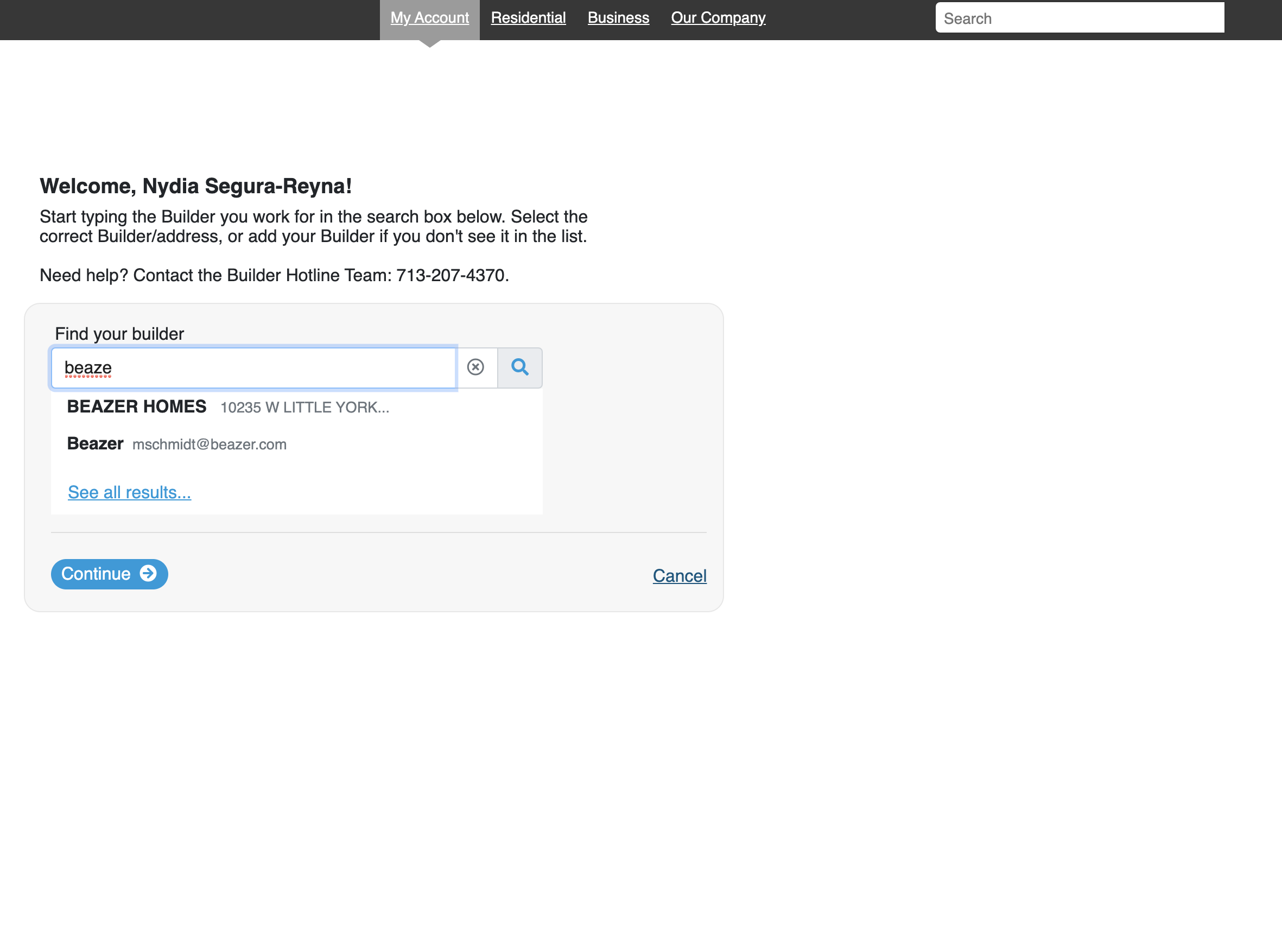
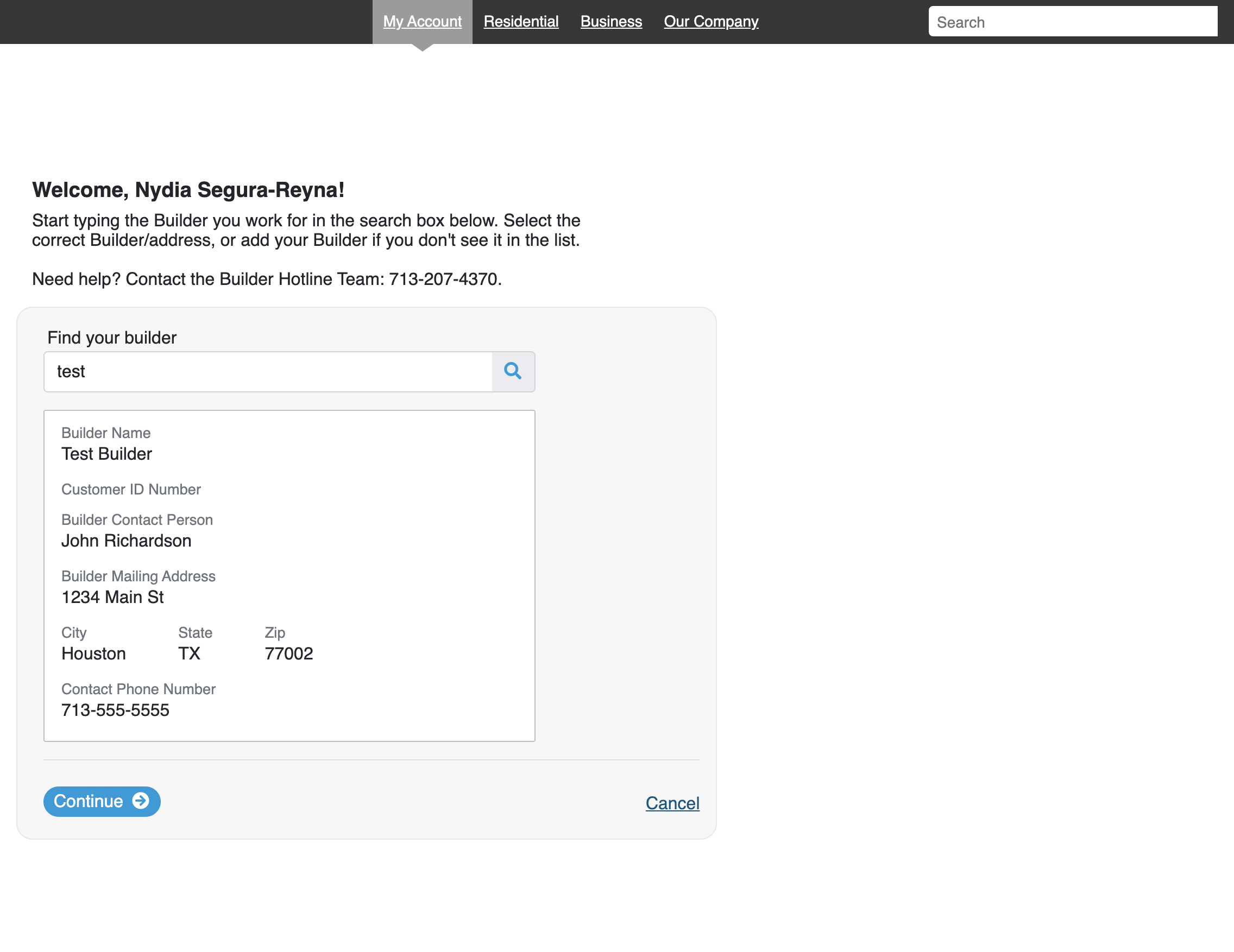
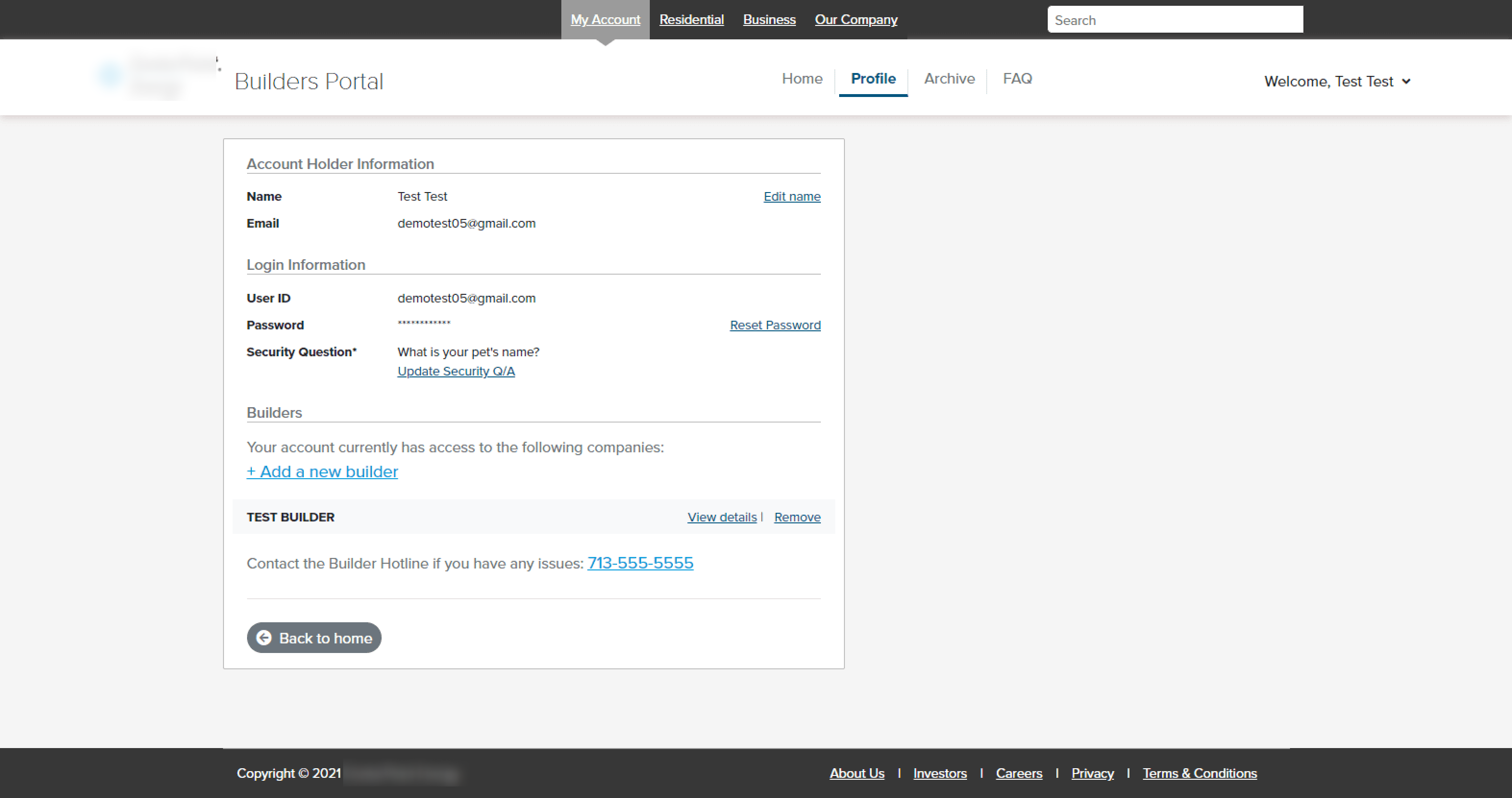
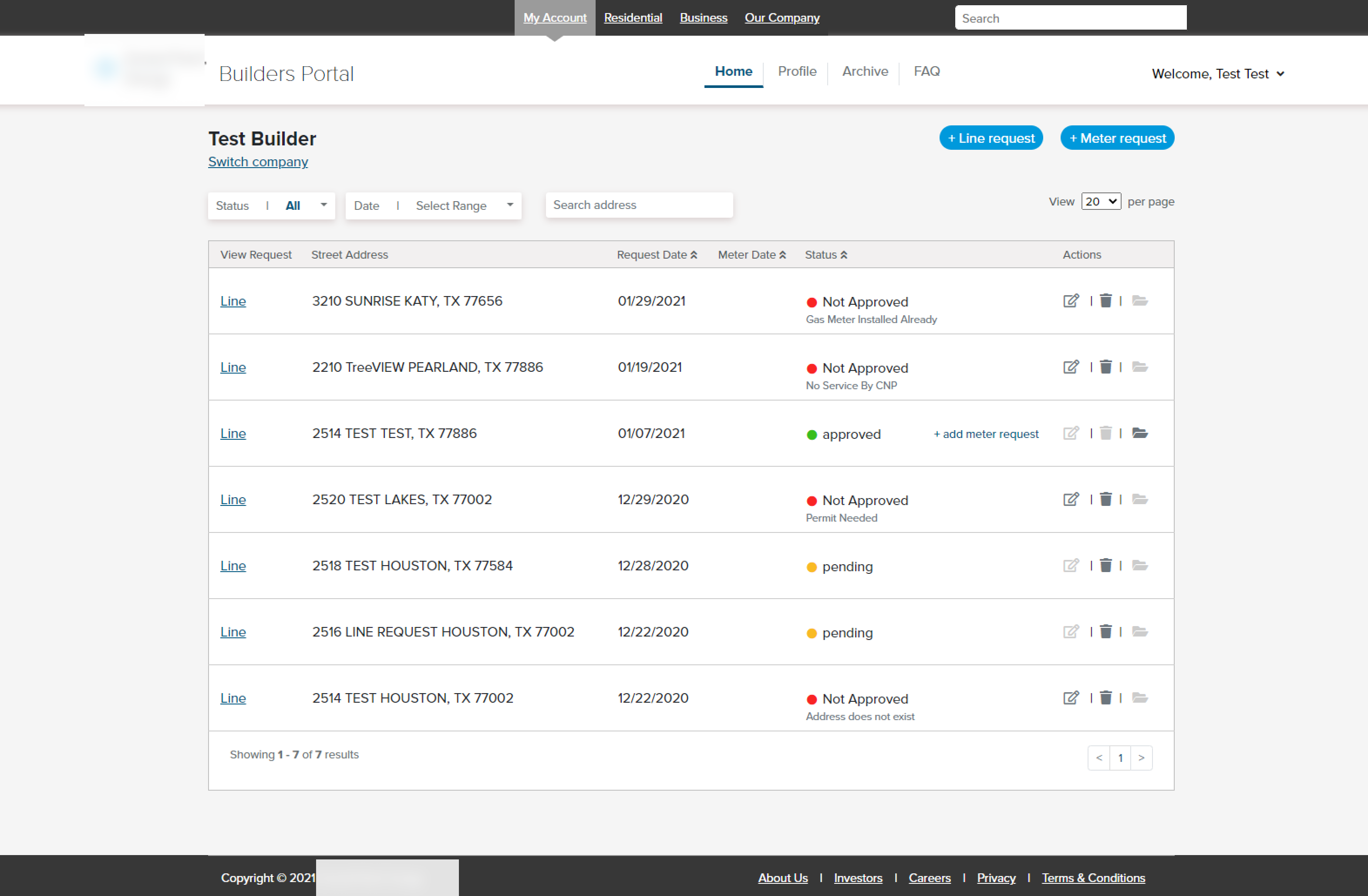
One of the biggest improvements was shifting registration toward self-service. Instead of relying on customer service to issue credentials, users could register with their email, choose the builder they worked for, and verify they had selected the correct company.
Work Order Visibility
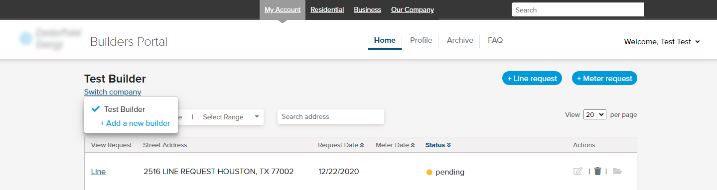
We also improved the work-order table so customers had better visibility into where requests stood and what actions they could take. That meant refining statuses, clarifying actions, and making the table easier to scan and organize.
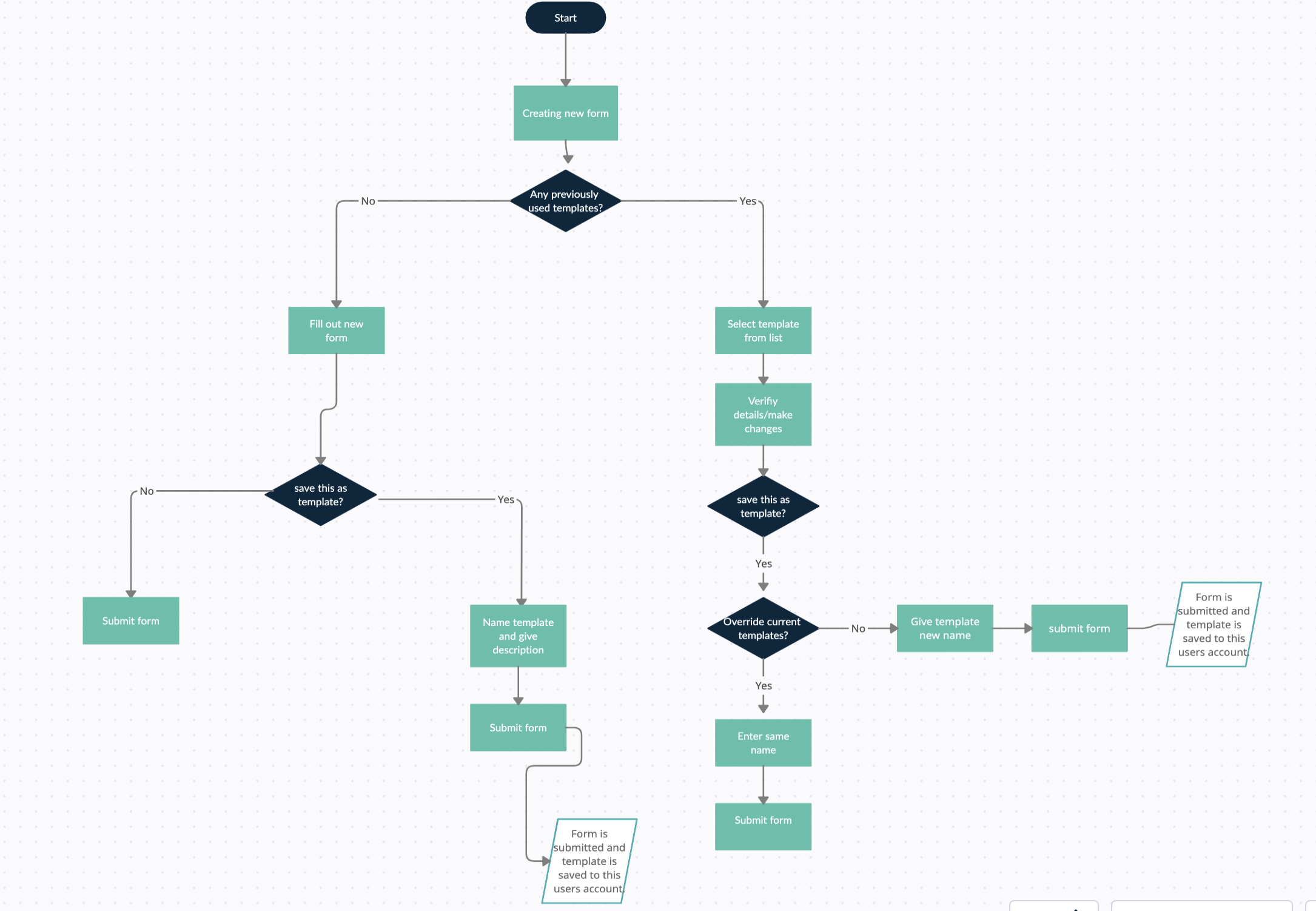
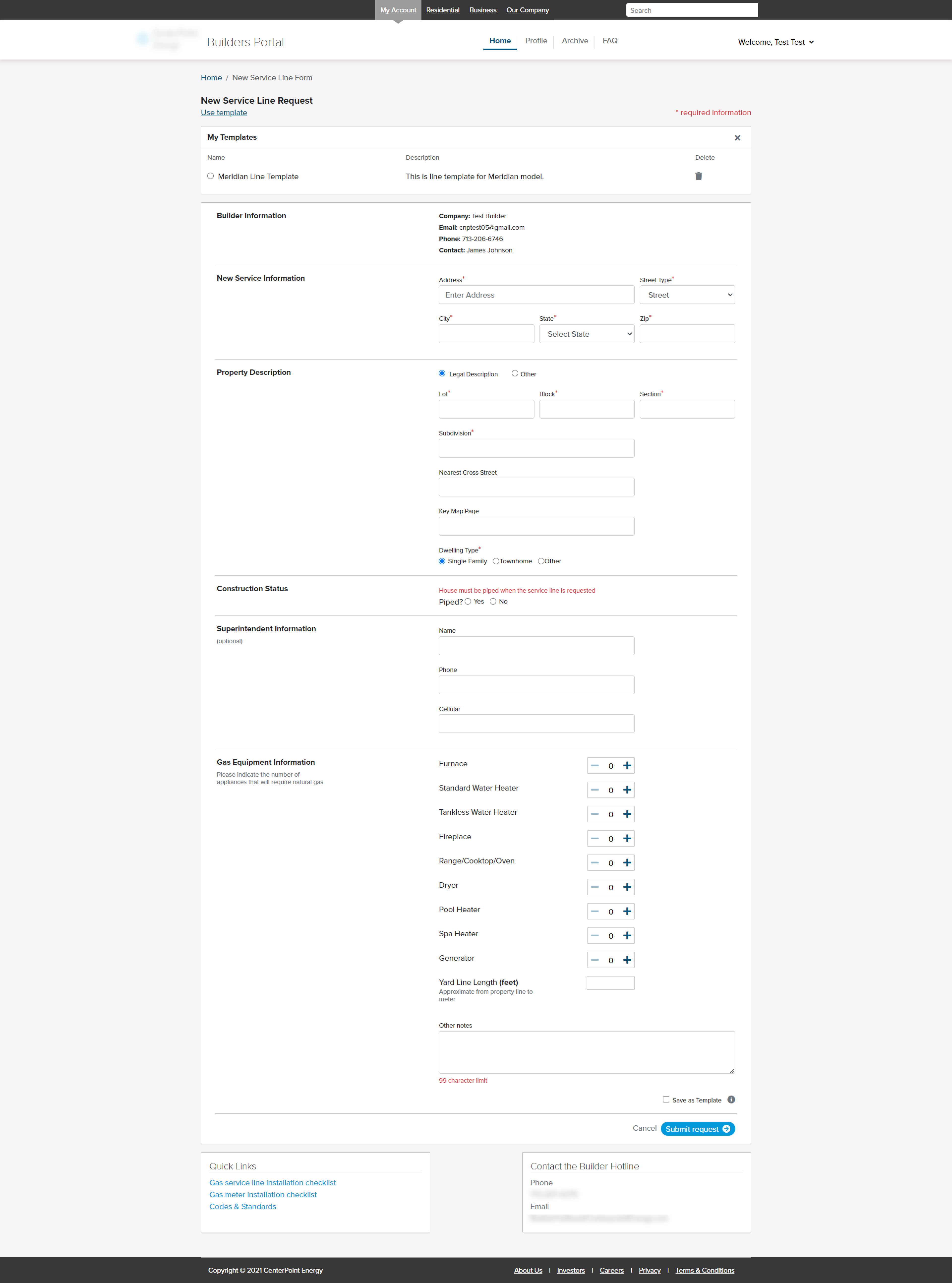
Forms and Templates
The request form kept the same core fields, but the experience was simplified into a more usable flow. A major improvement was allowing edits and reusable templates, which mattered because many customers submitted multiple similar requests across large development projects.
Outcome
The redesigned portal gave customers more autonomy at registration, clearer visibility into request progress, and less repetitive work when submitting forms. It also reduced customer-service dependency by making several key workflows easier to complete independently.
This was an earlier-career project for me, so the biggest takeaway was learning how to balance user needs, technical constraints, and shifting scope while still moving the product in a more useful direction.